Brand Strategy & Identity
PeopleLab
Client
PeopleLab
Year
2026
Scope
Brand Strategy & Identity
PeopleLab is a talent development partner for Malaysian organisations, from GLCs and government agencies to universities and large employers. We built the strategy, identity and website that let a new training firm sell measurable performance to the HR leaders who buy it.
Challenge:
PeopleLab entered a crowded market. Corporate training in Malaysia is full of established providers, and buyers tend to choose by referral, rapport and whether a programme is HRD Corp-claimable. As a new firm, PeopleLab had little brand awareness and a thin lead database. What it did have was a sharper idea than its competitors: ENDURE, a data-led system for assessing competency, finding skills gaps and proving training ROI. The brand had to make that idea credible to HR leaders before years of reputation could do the job.
Solution:
We started with the buyer. Our hero persona was a Head of Learning & Development at a GLC, government agency or company of 200+ staff: someone who treats talent development as a strategic investment and needs data she can take to management. Every decision that followed was built to earn her trust, from positioning around measurable performance, to an identity that reads modern and premium, to a website that turns ENDURE into a reason to book a consultation.
The Strategy
Discovery covered PeopleLab's purpose, its goals from one to ten years out, the providers it competes with, and the HR problems it solves, from judging trainer quality to predicting training ROI.
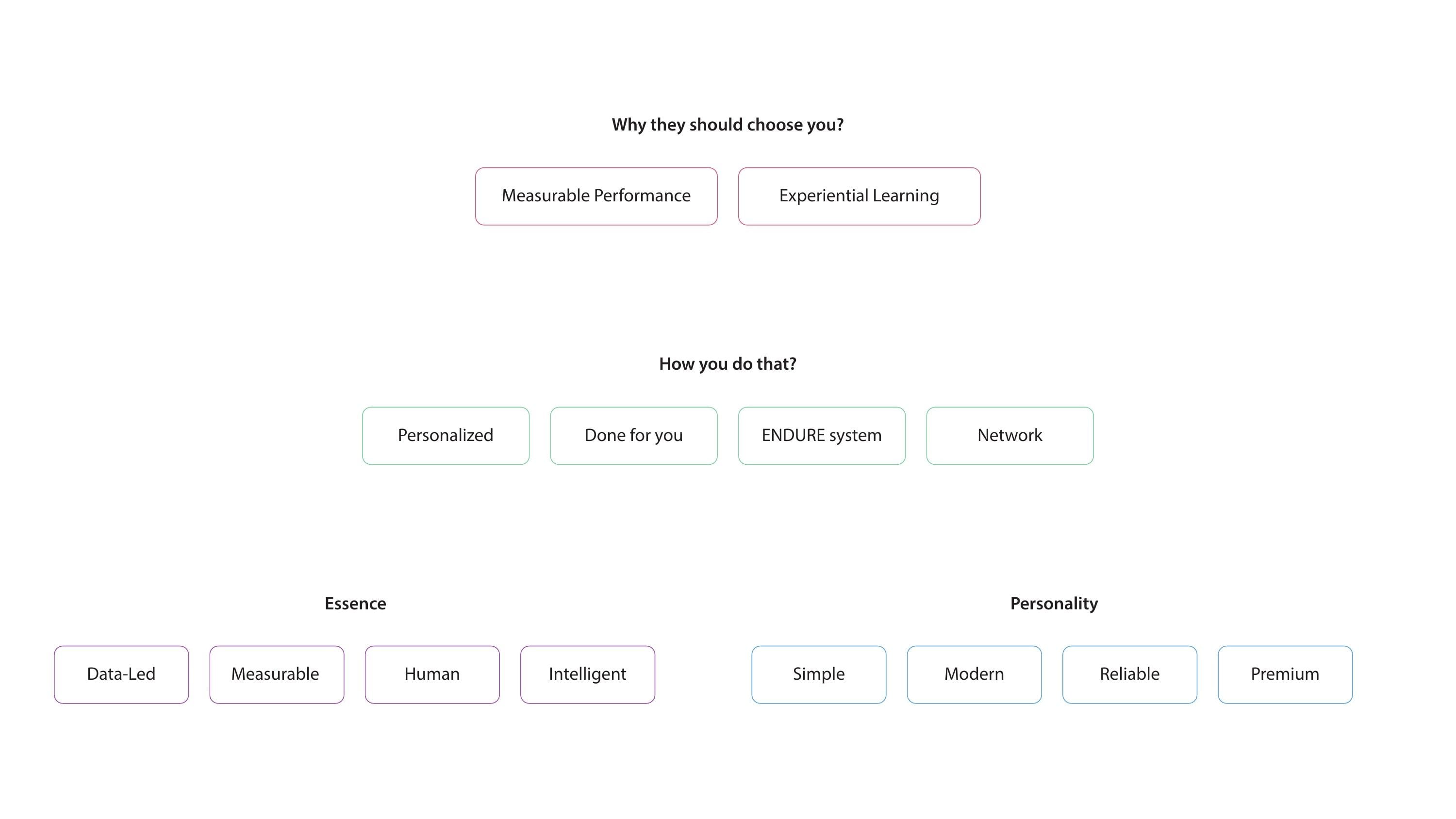
Two answers stood out for why clients should choose PeopleLab: measurable performance and experiential learning. Four proof points show how it delivers them: personalised programmes, a done-for-you service, the ENDURE system and a wide trainer network. We distilled the essence into four words (data-led, measurable, human, intelligent) and set the personality as simple, modern, reliable and premium. That gave the identity a clear brief: look as rigorous as the data and as warm as the people.
Logo Directions
We developed four directions, each drawn from a different idea in the strategy: a shield for professional credentials, a figure celebrating growth, people shaping an organisation, and an upward graph for performance.
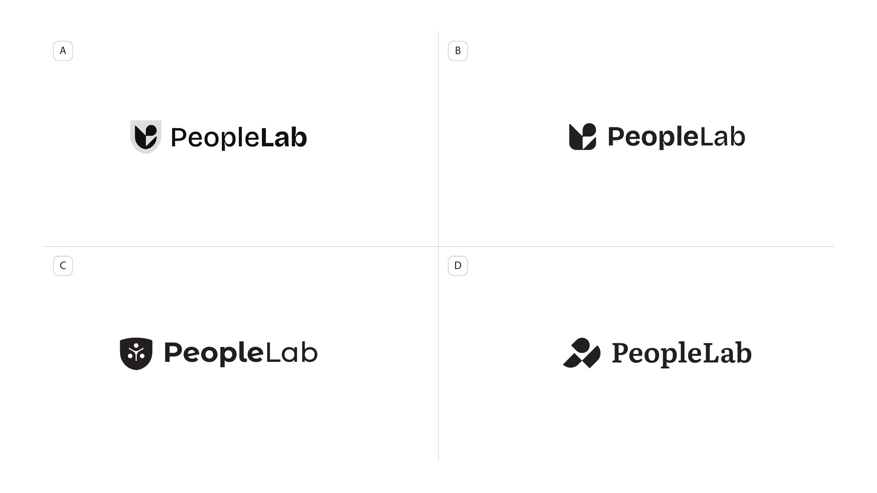
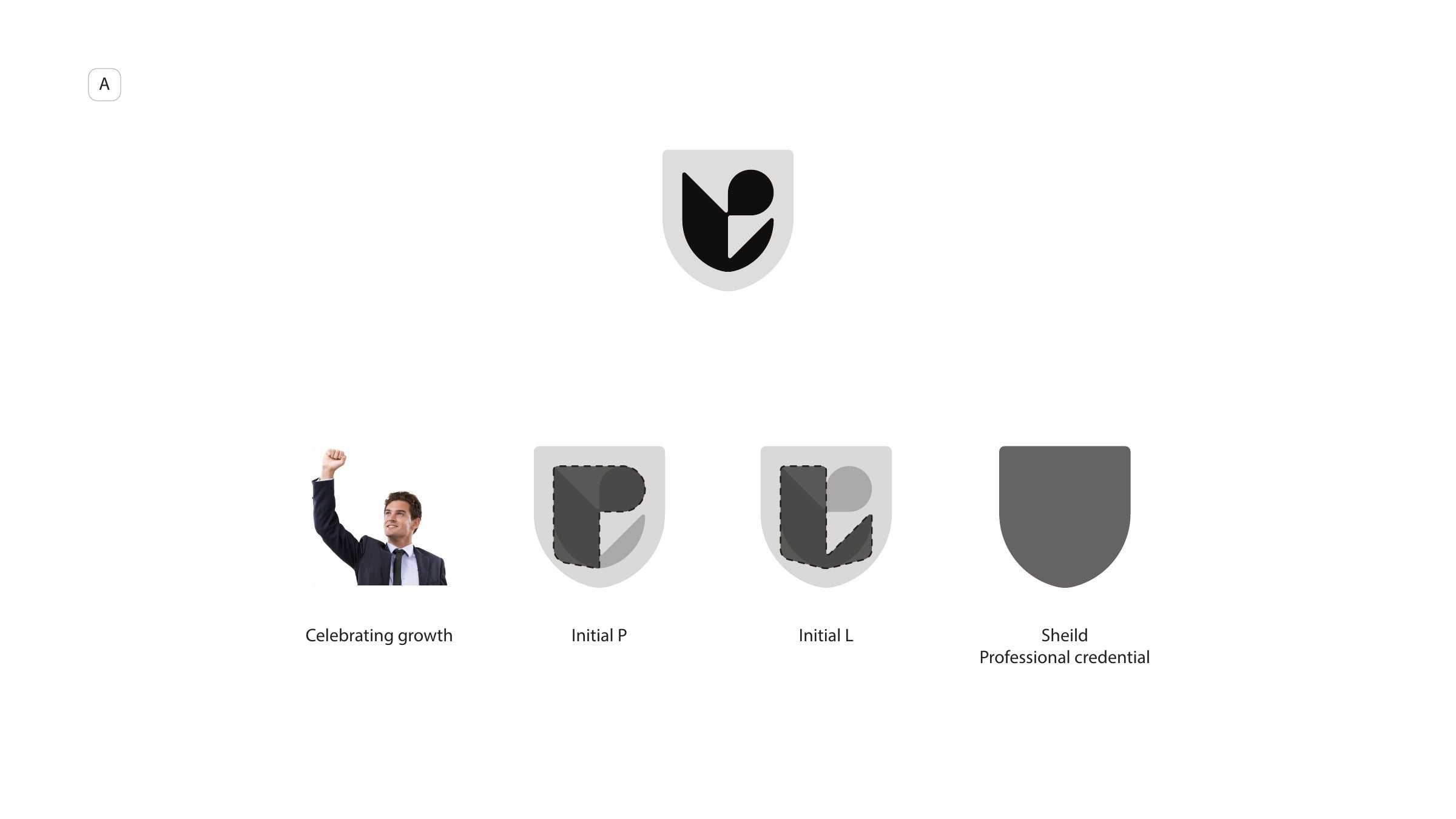
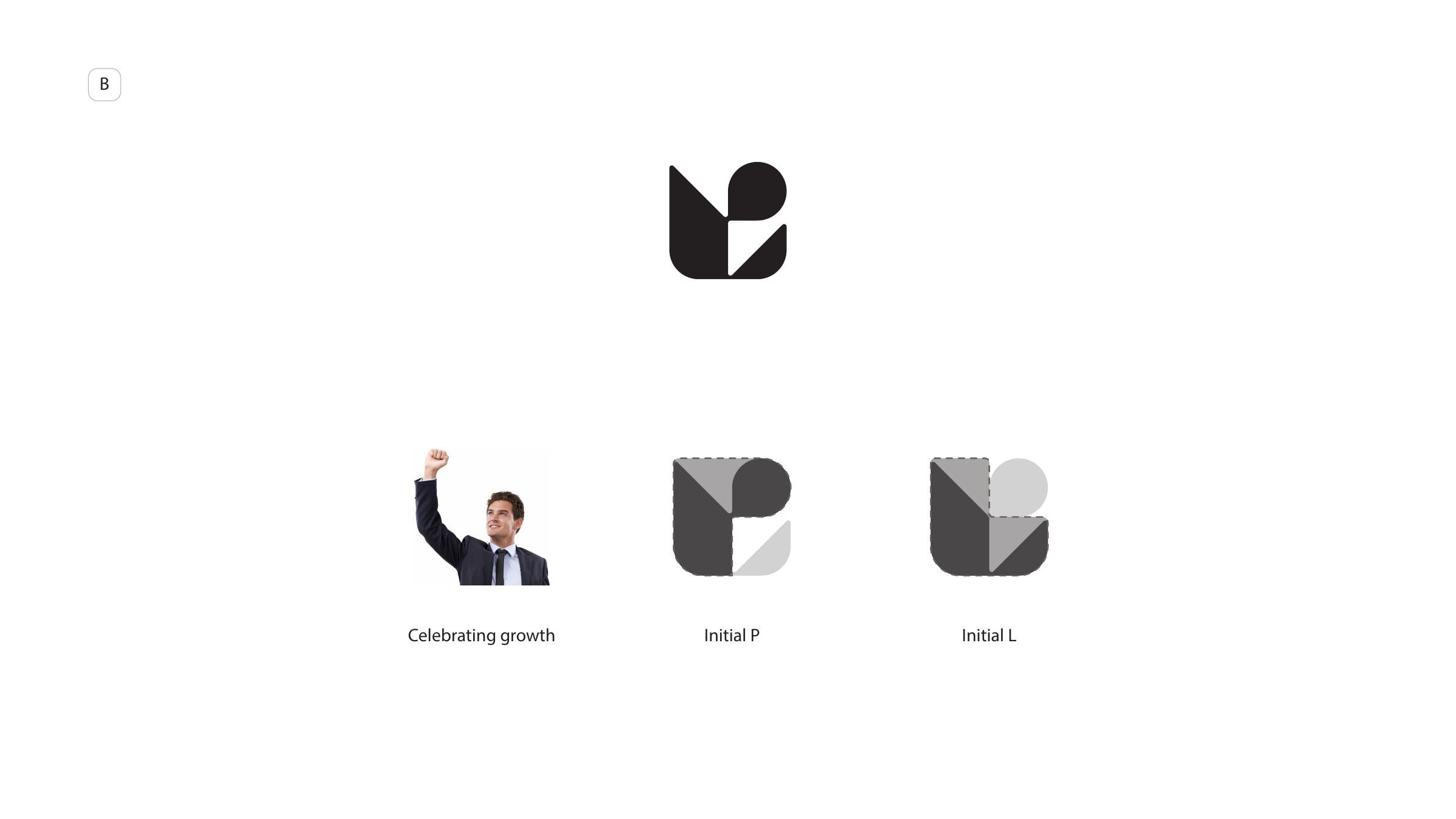
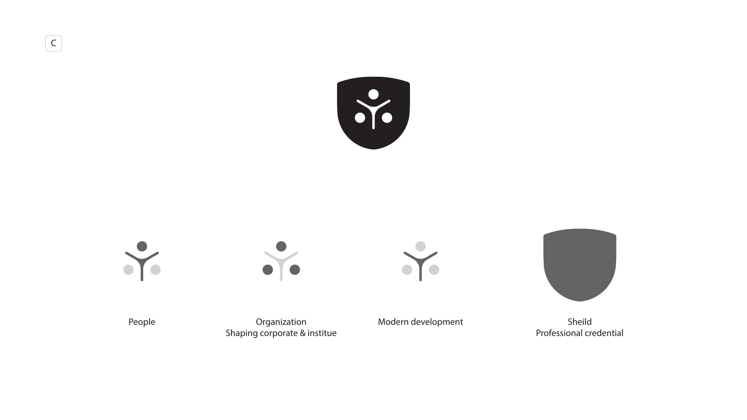
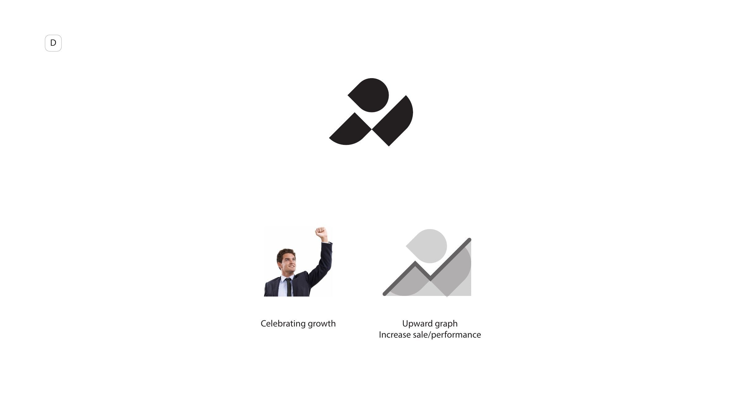
The final mark carries the initials idea from the first two directions forward and rebuilds it as a single form.
The Identity
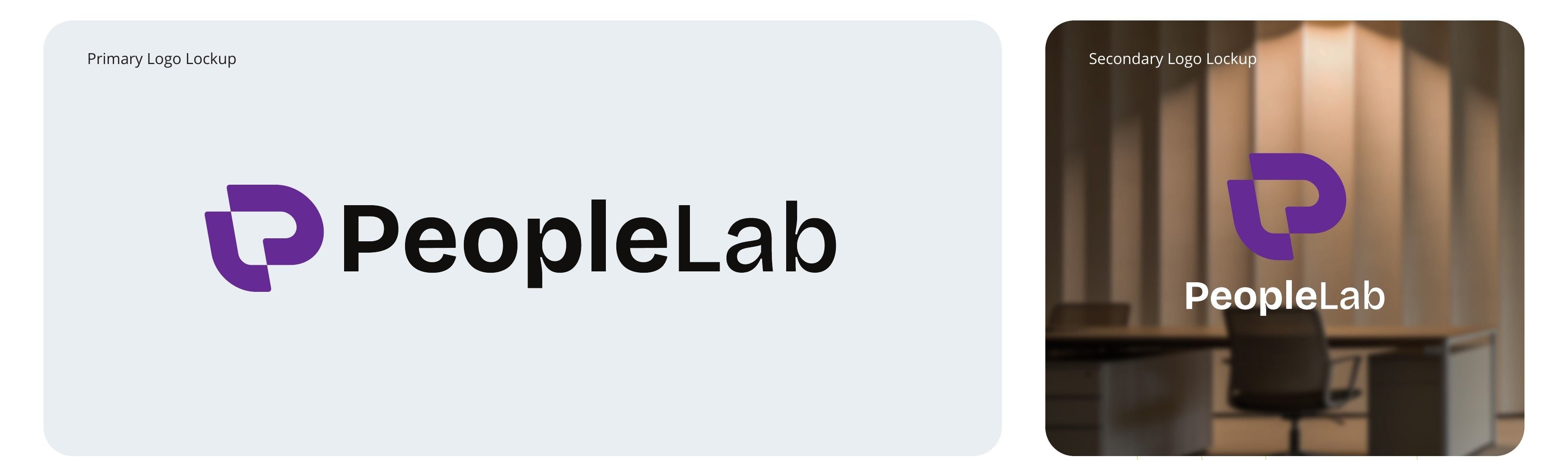
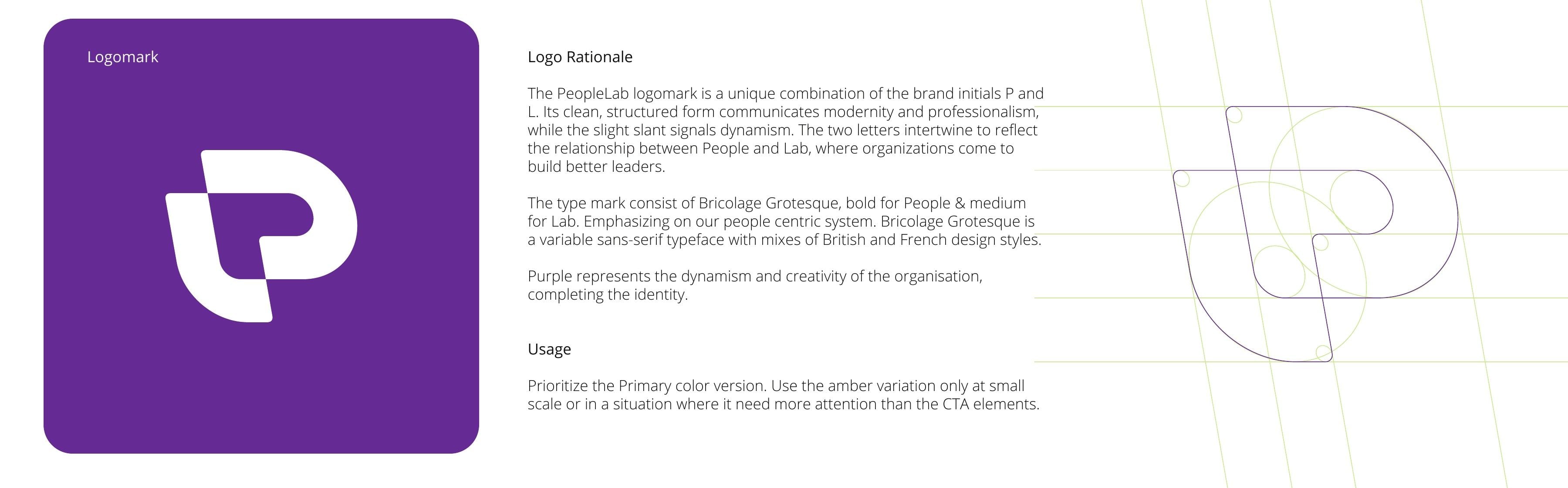
The logomark interlocks P and L on a 10° forward slant, a small cue of momentum. The two letters intertwine the way the name does: people on one side, the lab where organisations build better leaders on the other. Its corners and curves come from one construction grid, so the mark holds up from a favicon to a stage backdrop. The wordmark is set in Bricolage Grotesque, bold for People and medium for Lab, so the emphasis always lands on people.
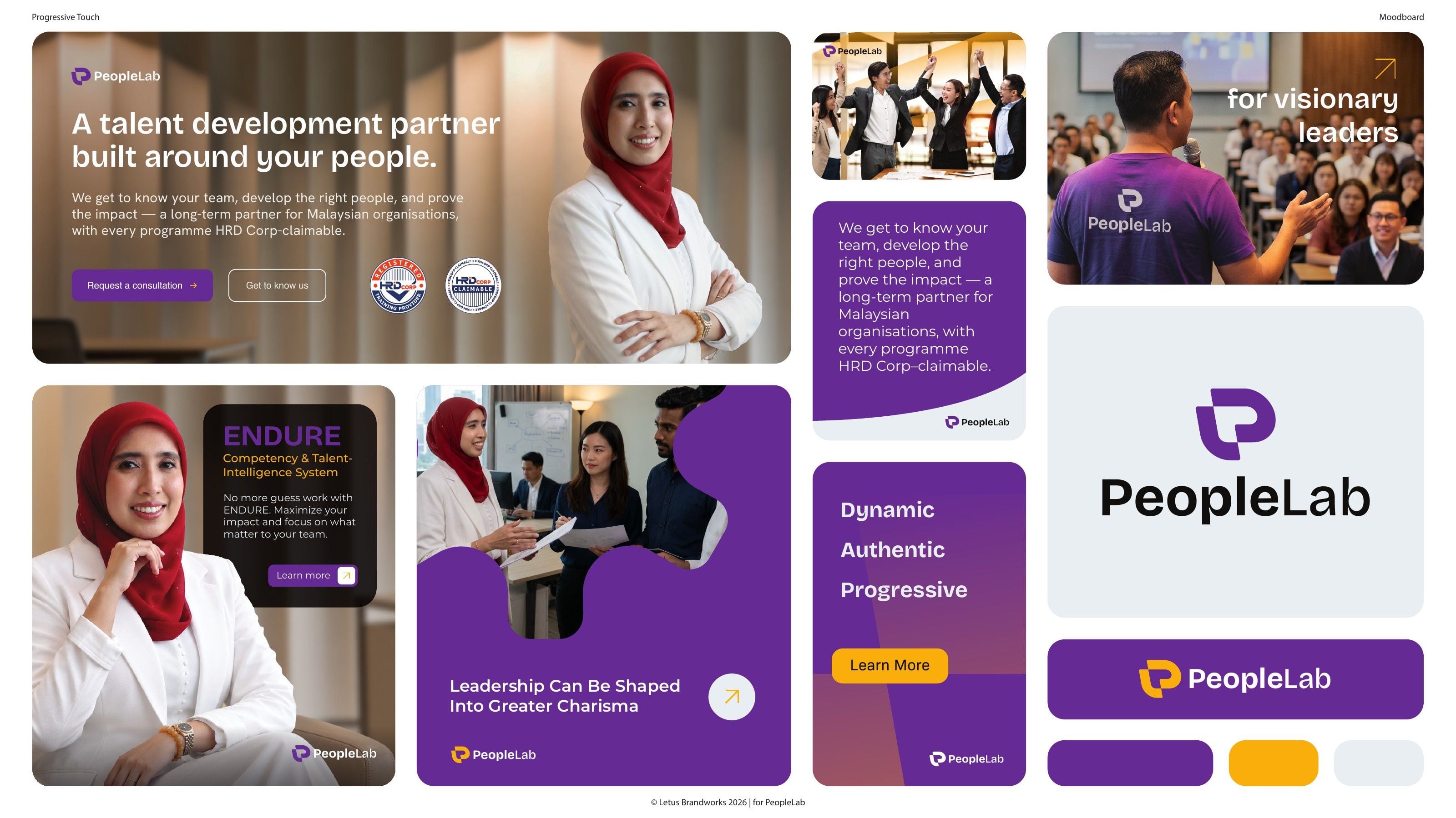
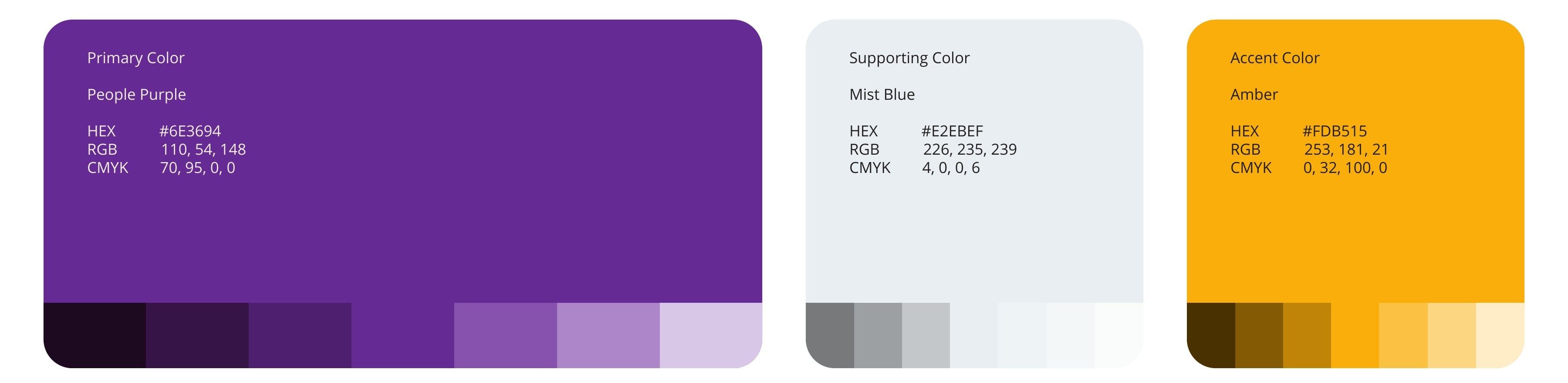
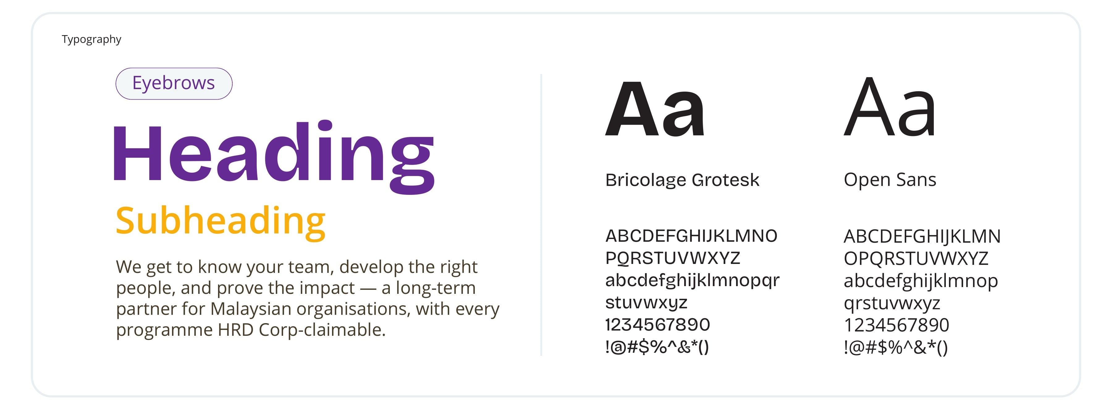
People Purple leads the palette and carries the brand's energy. Mist Blue gives every layout a calm working ground. Amber is held back for moments that need attention, such as calls to action and the logo at small sizes. Bricolage Grotesque sets the headlines, and Open Sans keeps long-form text easy to read.
Look & Feel
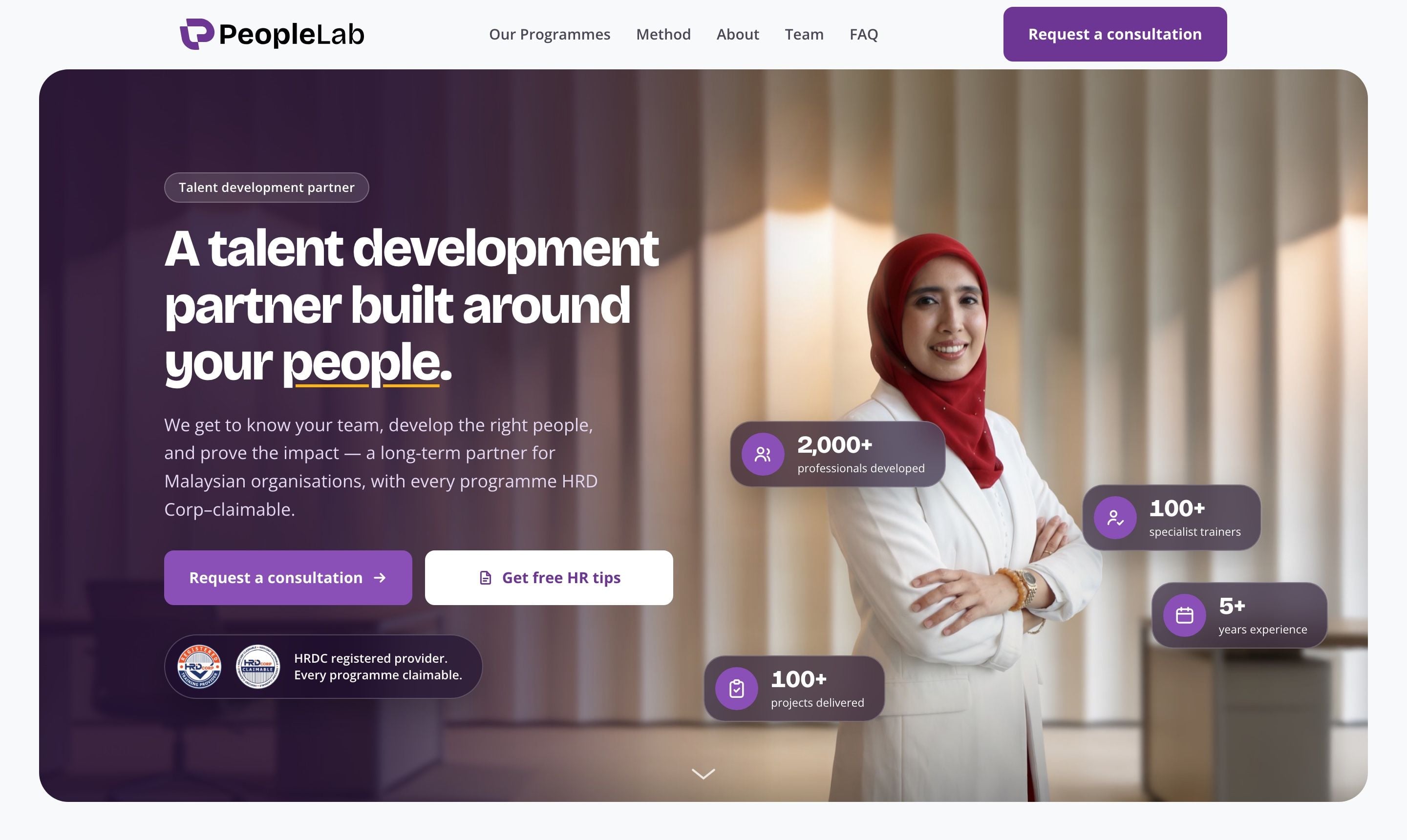
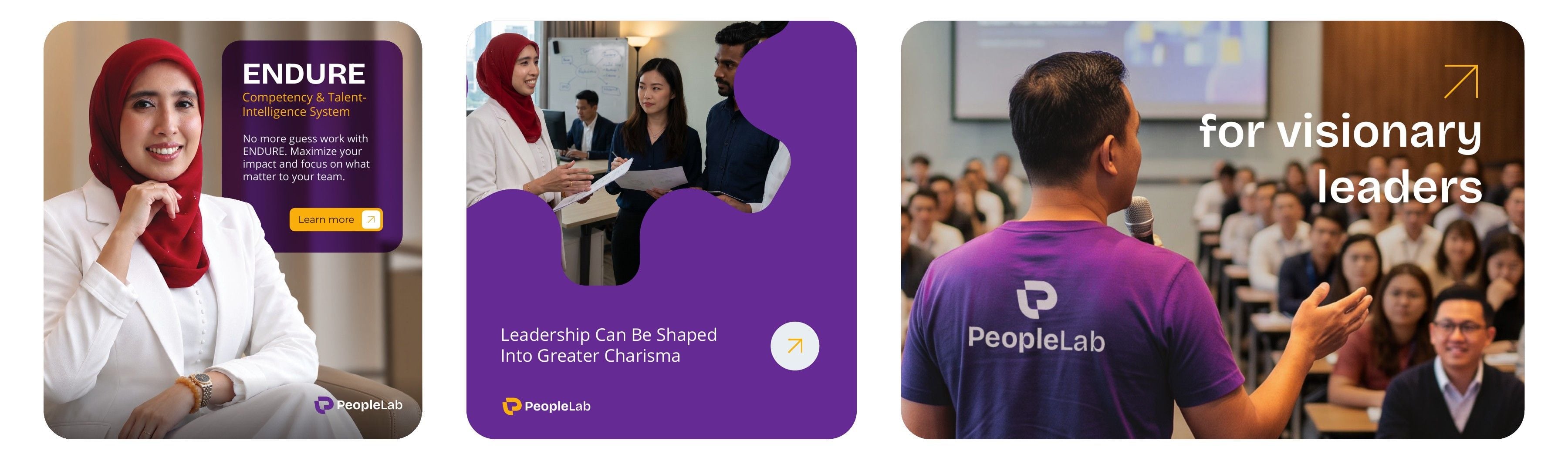
Real people sit at the centre of every frame. Purple fields hold the message, and proof points such as professionals developed and HRD Corp status sit beside the person they belong to, so the data always has a human face.
The Website
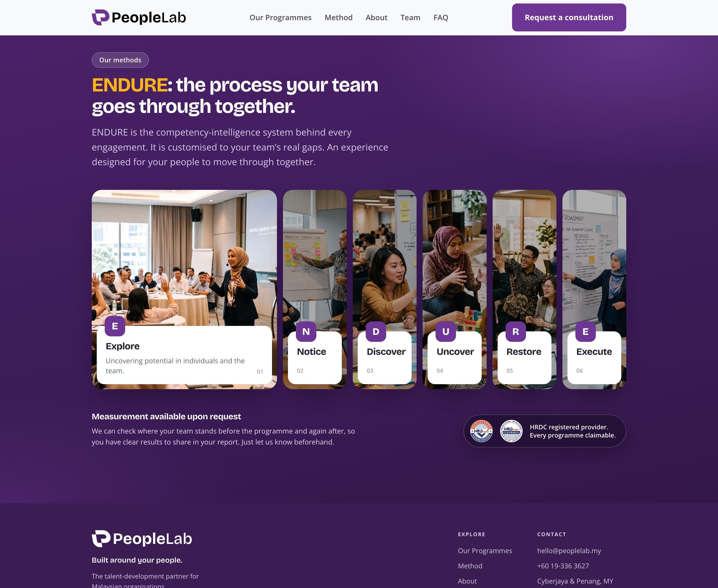
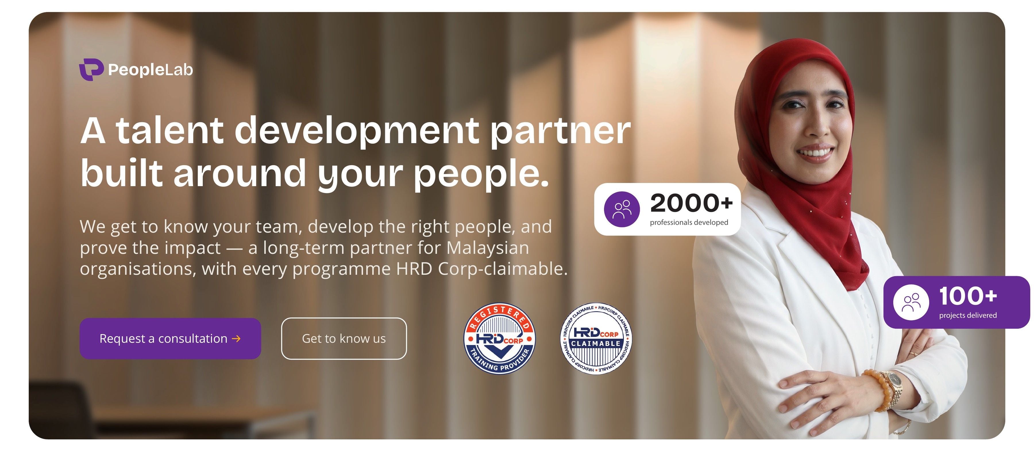
We designed and developed peoplelab.my for the same buyer. The hero leads with the partnership promise and puts the proof up front: HRD Corp registration, professionals developed and programmes delivered. The method section turns ENDURE into six named steps, Explore to Execute, that an HR manager can walk her director through.