
How to Choose Brand Colors: A 6-Step Method Built on Research, Not Myths
How to choose brand colors in 6 steps: start from positioning, map your category, own one lead color, build a palette, then test and document it.

To choose brand colors, start from your positioning, map the colors your competitors already use, pick one lead color you can own, build a working palette around it, test it for contrast and print, then document exact values. Research points one way: color works through fit and consistency. A color that matches what the brand stands for, used the same way for years, does more for a business than a "persuasive" shade picked from a psychology chart.
This guide walks through the method we use in our identity work, the research behind it, and the mistakes that make a palette fall apart in its first year.
What do brand colors actually do?
Brand colors do four jobs. A framework from marketing researchers Garber, Burke and Jones (2000), still cited in a 2024 systematic review, lists them: color signals the product category, triggers recognition of a specific brand, adds meaning and associations, and separates a brand from its competitors. A good palette is chosen with all four in mind.
The research on how color persuades is more modest than marketing blogs suggest, and more useful.
- Fit matters. Bottomley and Doyle (2006) found that people judge logo colors as more appropriate when the color suits the type of product, and when it matches the positioning the brand is trying to hold.
- Color shapes personality. Across four studies, Labrecque and Milne (2012) showed that a logo's hue, saturation and lightness all shift perceived brand personality. Their title carries the headline: exciting red, competent blue.
- Color works through the brand. The 2024 review of 37 studies found color influences purchase intention through five routes: brand image, brand attitude, consumer perception, color preference and the combination of design elements.
- Color alone builds little. A 2021 study by Torbarina, Čop and Jelenc found color had no effect on brand awareness for unfamiliar logos. Recognition comes from repetition over time.
The color statistic worth retiring
You have probably seen the claim that 85% of shoppers buy a product because of its color. It circulates attributed to a KISSmetrics infographic (example), and we could not trace it to any published survey, sample or method. The peer-reviewed evidence above makes a smaller, sturdier claim: the right color, used consistently, strengthens what the brand already means.
How to choose brand colors in 6 steps
Step 1: Start from positioning and personality
Color decisions come after strategy. Take the three to five personality traits from your brand strategy and translate each into color properties:
- Hue carries association (warm, cool, earthy, synthetic).
- Saturation carries energy. Labrecque and Milne found highly saturated logo colors read as more exciting.
- Lightness carries weight. Deep values read as serious and established, pale values as soft and approachable.
A calm, premium advisory firm and a loud challenger snack brand can both use orange. One uses a deep, desaturated burnt orange, the other a bright, saturated one.
Step 2: Map your category
Collect the logos, websites and packaging of 10 to 15 competitors and note each one's dominant color. Most categories cluster: finance leans blue, wellness leans green, kids' brands lean primary.
Then decide on purpose. Matching the category tells buyers you belong. Breaking it makes you easier to remember. The von Restorff effect, first reported in 1933, shows that an item that differs from its neighbors is recalled better. Both choices can be right. The mistake is drifting into the category color by default.
Step 3: Choose one lead color you can own
Recognition attaches to one color, so pick one to lead. Tiffany & Co. has held a color trademark on its blue since 1998, mixed by Pantone as a private custom shade numbered 1837, the year the company was founded.
Legal ownership is hard to win. Cadbury lost at the UK Court of Appeal in October 2013 over its application for purple, and again in December 2018 when it tried to widen its registration. For most businesses, ownership is built in buyers' minds through years of consistent use. Letus Brandworks' own identity leads with a single orange, the one on this page, and runs everything else on cream and charcoal.
Step 4: Build the working palette
A lead color cannot carry a website, a deck and a packaging range on its own. A complete palette has four layers:
- Lead color (one): the recognition color, used in small, decisive amounts.
- Supporting colors (one or two): for depth, illustration and secondary emphasis.
- Neutrals (two to four): backgrounds, body text, lines and surfaces. These do most of the work.
- Functional colors (if you have a digital product): success, warning and error states.
A useful starting ratio is 60 to 70 percent neutrals, 20 to 30 percent supporting colors and about 10 percent lead. The lead color stays powerful because it is rationed.
Step 5: Test before you commit
A palette that looks good on a presentation slide can fail in daily use. Test four things:
- Contrast. WCAG 2.2 requires a 4.5:1 contrast ratio for body text, 3:1 for large text, and 3:1 for icons, buttons and the graphics people need to understand content. Bright brand colors often fail as text colors on white.
- Color vision deficiency. About 1 in 12 men has some form of it, most often red-green. Never let color alone carry meaning, such as a red or green status with no label.
- Print. Screens mix light in RGB and printers mix ink in CMYK. Vivid oranges, greens and blues often dull in print, so specify a Pantone match and proof on the real paper stock.
- Real applications. Mock up the website, a social post, packaging and signage, and place them beside competitors. Judge the palette in context, never on a swatch sheet.
Step 6: Specify and document
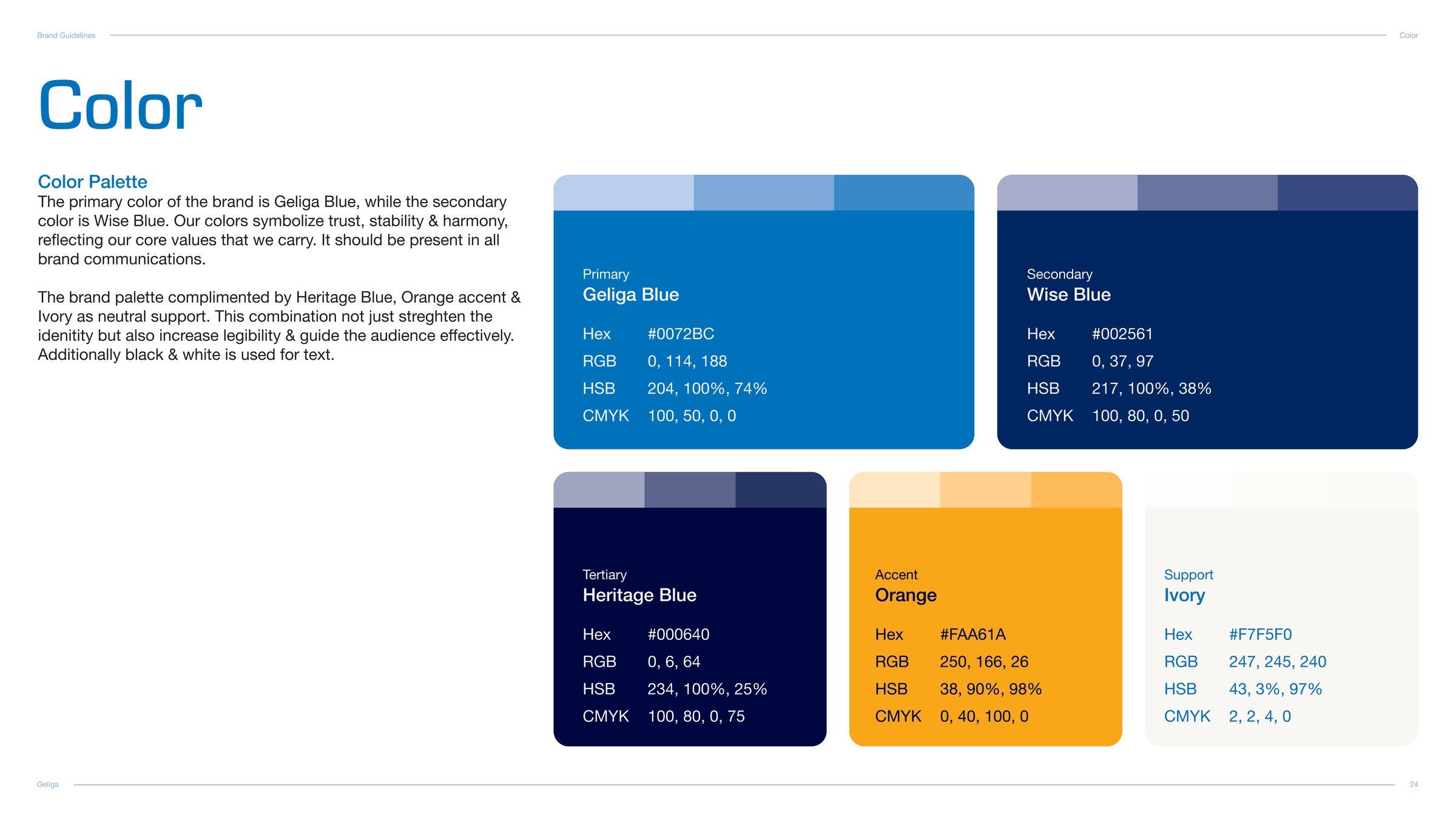
Record every color as HEX, RGB, CMYK and Pantone, with usage ratios, approved combinations, accessible text pairings and clear rules on what to avoid. This belongs in your brand guidelines, where every designer, printer and developer can find the same values.
Common brand color mistakes
- Choosing the founder's favorite color. Personal taste is a weak brief. Personality and category are strong ones.
- Copying the category leader. It makes you look like the leader's cheaper alternative.
- Too many colors. Each extra color dilutes recognition of the lead.
- Screen-only values. A palette with no CMYK or Pantone values will drift the first time it is printed.
- Changing shades campaign by campaign. Consistency is the mechanism that builds recognition, so every variation spends some of it.
Color is one layer of a visual identity system, alongside typography, logo, imagery and layout. That is why our Visual Identity service treats it as a system, and you can see color systems we have built for clients in our work.
Frequently asked questions
How many colors should a brand have?
Most strong brand palettes use three to six colors: one lead color, one or two supporting colors and two to four neutrals. Digital products add functional colors for success, warning and error states.
Can you trademark a brand color?
Sometimes, and it is difficult. Tiffany & Co. registered its blue in 1998, while Cadbury lost two UK Court of Appeal cases over its purple, in 2013 and 2018. A color must be precisely defined and proven to identify your business before it can be registered.
What is the best color for a brand?
No single color is best. The best brand color fits your positioning and personality, stands apart from your category, passes accessibility checks and gets used consistently for years.
Does color psychology work for branding?
Partly. Peer-reviewed studies show colors shift perceived brand personality and appropriateness, but the effect depends on product type, context and culture. Use color associations as a check on your strategy, and avoid using them as the starting point.
How do I check if my brand colors are accessible?
Run every text and background pair through a contrast checker against WCAG 2.2: at least 4.5:1 for body text and 3:1 for large text, icons and interface elements. Then preview the palette in a color blindness simulator.
If your colors were chosen before your positioning was clear, or your palette looks different on every channel, talk to the studio. We build color systems as part of a complete identity, grounded in strategy and tested in the real world.